Landing page with styled-components and react-bootstrap
We are going to create a Landing page using react-bootstrap components and styled-components.

Requirements
This guide assumes you already have installed in your system node v.15.14.0 or newer, on any Linux dist you can use nvm to quickly change your node versions.
Setting up the environment
We have to create a new react-app for our landing page.
mkdir styled-components-landingPage
cd styled-components-landingPage
yarn create react-app my-app
cd my-app
yarn start
After running yarn start a new browser window will be opened with your project.
Create a basic landing page
Create the LandingPage file:
After running yarn create react-app, let’s start creating a new folder for all our components:
cd src
mkdir components
Inside our components folder create a LandingPage.js file. We are capitalizing this file name, so it matches the JavaScript class that we are going to create.
cd components
touch LandingPage.js
Call our LandingPage instead of the example App:
The index.js file should have this code:
ReactDOM.render(
  <React.StrictMode>
    <App />
  </React.StrictMode>,
  document.getElementById('root')
);
Index is calling the method render from ReactDOM. This method set the html code for the element with the id root.
The example just renders the component called App. We don’t want to render <App />, we want it to render <LandingPage /> to test our project.
So we have to change it:
ReactDOM.render(
  <React.StrictMode>
    <LandingPage />
  </React.StrictMode>,
  document.getElementById('root')
);
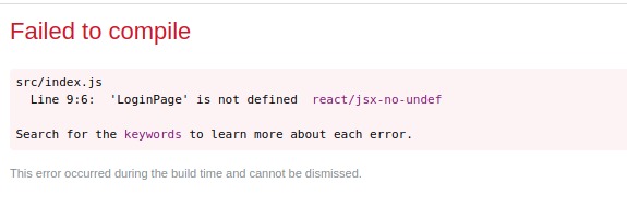
If you check our project in the browser, you may think that it’ll render a blank page because the LandingPage.js file is empty.
React checks if everything is ok when is trying to compile the code, so it’ll tell us that our component is not defined:
Creating a react component:
Let’s fix the last error, in LandingPage.js define the new component:
import React from 'react'
export class LandingPage extends React.Component{
    render(){
        return()
    }
}
NOTE: The class must be exported by adding the export word before class, so it can be used by the index.js file.
The content that we want to display in the browser must be the return of the render function.
For example, let’s render a simply paragraph with the text This is a paragraph.
export class LandingPage extends React.Component{
    render(){
        return(<p>This is a paragraph</p>)
    }
}
Use a react component:
To import this component in the index.js file, just a line should be added.
In index.js the LandingPage is imported using relative paths.
import { LandingPage } from './components/LandingPage'
ReactDOM.render(
  <React.StrictMode>
    <LandingPage />
  </React.StrictMode>,
  document.getElementById('root')
);
Great! Now we see “This a paragraph” in our browser!

Create content with react-bootstrap
Install react-bootstrap:
Let’s create the content for the landing page instead of the paragraph: one row with two columns.
In the first column, we are going to show a logo. In the second one, a h1 with a button that allows us to login.
For that, let’s install react-bootstrap:
yarn add react-bootstrap bootstrap
And add the following link in index.html (this file is in public folder).
    <link
      rel="stylesheet"
      href="https://cdn.jsdelivr.net/npm/bootstrap@4.6.0/dist/css/bootstrap.min.css"
      integrity="sha384-B0vP5xmATw1+K9KRQjQERJvTumQW0nPEzvF6L/Z6nronJ3oUOFUFpCjEUQouq2+l"
      crossorigin="anonymous"
    />
Create components with react-bootstrap:
Add Row and Col components:
To create these components in the LoginPage.js file, we only have to import them from react-bootstrap and add them in the return statment.
import Row from 'react-bootstrap/Row'
import Col from 'react-bootstrap/Col'

export class LandingPage extends React.Component{
    render(){
        return(
          <Row>
            <Col xs={6}></Col>
            <Col xs={6}></Col>
          </Row>
        )
    }
}
Add Image component:
Let’s add the logo in the first column. First, let’s create an images folder for our project (src/images).
cd ..
mkdir images
For images, react-bootstrap has a specific component.
import Image from 'react-bootstrap/Image'

export class LandingPage extends React.Component{
    render(){
        return(
        <Row>
            <Col xs={6}>
                <Image src="" />
            </Col>
            <Col xs={6}></Col>
        </Row>
        )
    }
}
Let’s import the image logo. In src, the logo has to be called between {} to access the variable’s value.
import logo from '../images/logo.png'

export class LandingPage extends React.Component{
    render(){
        return(
        <Row>
            <Col xs={6}>
                <Image src={logo} />
            </Col>
            <Col xs={6}></Col>
        </Row>
        )
    }
}
In the browser you should see something like this:

Add Button component:
Let’s add the h1 and button (component from react-bootstrap) in the second column:
import Button from 'react-bootstrap/Button'

export class LandingPage extends React.Component{
    render(){
        return(
        <Row>
            <Col xs={6}>
                <Image src={logo} />
            </Col>
            <Col xs={6}>
                <h1>Welcome!</h1>
                <Button>Login</Button>
            </Col>
        </Row>
        )
    }
}
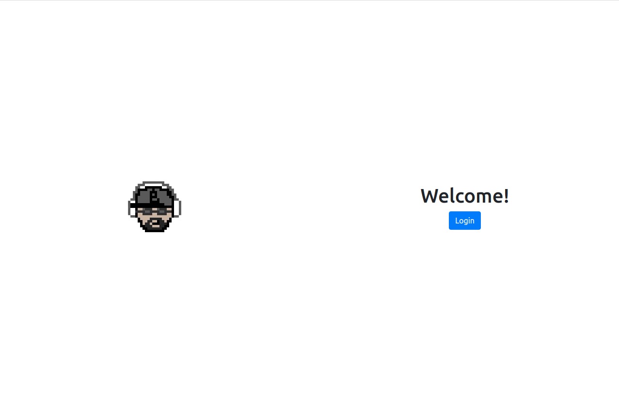
In the browser you should see something like this:

Create styles with styled-components
Install lib styled-components:
Let’s install styled-components to style the content.
yarn add styled-components
Style Row with styled-components:
Let’s center the content of the row vertically and horizontally.
- Import
styledfrom'styled-components'
import styled from 'styled-components'
- Create a
constant, the name must be capitalize. We are going to pass astringvalue to thestyledfunction to define the component style.
const StyledRow = styled(Row)`{
    display: flex;
    align-items: center;
    text-align: center;
    height: 100vh;
    margin: 0;
}`
NOTE: The code inside styled has to represent the component. It could be a html element or a react component.
- Replace
Rowfor the newly created componentStyledRow:
export class LandingPage extends React.Component{
    render(){
        return(
        <StyledRow>
            <Col xs={6}>
                <Image src={logo} />
            </Col>
            <Col xs={6}>
                <h1>Welcome!</h1>
                <Button>Login</Button>
            </Col>
        </StyledRow>
        )
    }
}
In the browser you should see something like this:
Style Image with styled-components:
Let’s create the style for our image.
- Define the style in a
constantand replace theImage:
const StyledImage = styled(Image)`{
    max-width: 100%;
    height: auto;
    width: 200px;
}`

export class LandingPage extends React.Component{
    render(){
        return(
        <StyledRow>
            <Col xs={6}>
                <StyledImage src={logo} />
            </Col>
            <Col xs={6}>
                <h1>Welcome!</h1>
                <Button>Login</Button>
            </Col>
        </StyledRow>
        )
    }
}
Style html elements with styled-components:
- Create a
constantto define the style of theh1. This is a html element so we write it after a dot.
const StyledH1 = styled.h1`{
    color: green;
    font-weight: 800;
}`;

<StyledH1>Welcome!</StyledH1>
In the browser you should see something like this:

Style pseudo-classes with styled-components:
- Define the
buttonstyle in aconstant:
const StyledButton = styled(Button)`{
    border-radius: 2rem;
    background-color: gray;
    padding: 0.3rem 2rem ;
    border: none;
}`;

 <StyledButton>Login</StyledButton>
In the browser you should see something like this:

The hover action displays a blue background. Let’s apply a light gray color to the pseudo classes hover, active and focus.
const StyledButton = styled(Button)`{
    border-radius: 2rem;
    background-color: gray;
    padding: 0.3rem 2rem ;
    border: none;
    &:hover,
    :not(:disabled):not(.disabled):active,
    :focus,
    :not(:disabled):not(.disabled):active:focus{
        color: black;
        background-color: #f5f5f5;
        box-shadow: none;

    }
}`;
NOTE: To style hover, active or focus, we need to add an & for it to work.
In the browser you should see something like this:

Add icons from font-awesome:
Let’s add an icon after the text in our button.
- Install font-awesome
yarn add @fortawesome/fontawesome-svg-core
yarn add @fortawesome/free-solid-svg-icons
yarn add @fortawesome/react-fontawesome
yarn add @fortawesome/free-brands-svg-icons
yarn add @fortawesome/free-regular-svg-icons
- Import the
iconthat you want and add it in thebutton
import { FontAwesomeIcon } from '@fortawesome/react-fontawesome'
import { faSignInAlt } from "@fortawesome/free-solid-svg-icons";

<StyledButton>Login <FontAwesomeIcon icon={faSignInAlt}/></StyledButton>
- Style the
iconwith ayellowcolor. As the icon is asvginside thebutton, we can style it in thebuttonitself.
const StyledButton = styled(Button)`{
    border-radius: 2rem;
    background-color: gray;
    padding: 0.3rem 2rem ;
    border: none;
    &:hover,
    :not(:disabled):not(.disabled):active,
    :focus,
    :not(:disabled):not(.disabled):active:focus{
        color: black;
        background-color: #f5f5f5;
        box-shadow: none;
    }
    svg{
        color:yellow;
    }
}`
In the browser you should see something like this:
Add responsive breakpoints with styled components:
In mobile, let’s give a smaller width to our logo.
Add in StyledImage @media.
const StyledImage = styled(Image)`{
  max-width: 100%;
  height: auto;
  width: 200px;
  @media (max-width: 576px){
      width:100px;
  }
}`
NOTE: write the responsive breakpoints from highest to lowest
In the browser you should see something like this:

Reusing components with same styles:
Let’s add a new Image below our button, for example the logo related to styled components but smaller.
For this, we want to use some of the properties that we add in StyledImage, but not all of them.
In these cases we should create a new component so we can reuse the properties.
- Create a
new componentin our components folder.
cd components
touch ImageWithStyle.js
-
Import
React,Imageandstyledcomponents. -
Create the
styled constantfor theImagecomponent -
Specify the
srcandclassNameproperties using the classprops. This allows us to use the component in several scenarios.
import React from 'react'
import Image from 'react-bootstrap/Image'
import styled from 'styled-components'

const StyledImage = styled(Image)`{
    max-width: 100%;
    height: auto;
}`;

export class ImageWithStyle extends React.Component{
    render(){
        return(
            <StyledImage src={this.props.src} className={this.props.className} />
        )
    }
}
-
In
LandingPage.jsdelete the information that we are using now inImageWithStyle. -
Import
ImageWithStyleinLandingPage.jscall it in the first column:
import { ImageWithStyle } from "../components/ImageWithStyle"

export class LandingPage extends React.Component{
    render(){
        return(
        <StyledRow>
            <Col xs={6}>
                <ImageWithStyle />
            </Col>
            <Col xs={6}>
                <StyledH1>Welcome!</StyledH1>
                <StyledButton>Login <FontAwesomeIcon icon={faSignInAlt}/></StyledButton>
                <ImageWithStyle />
            </Col>
        </StyledRow>
        )
    }
}
- Create the constants to style
ImageWithStyle.
const StyledLogoPage = styled(ImageWithStyle)`{
    width: 200px;
    @media (max-width: 576px){
         width:100px;
    }
}`;

const StyledLogoStyledComp = styled(ImageWithStyle)`{
    width:80px;
}`;

export class LandingPage extends React.Component{
    render(){
        return(
        <StyledRow>
            <Col xs={6}>
                <StyledLogoPage />
            </Col>
            <Col xs={6}>
                <StyledH1>Welcome!</StyledH1>
                <StyledButton>Login <FontAwesomeIcon icon={faSignInAlt}/></StyledButton>
                <StyledLogoStyledComp />
            </Col>
        </StyledRow>
        )
    }
}
- Instance the properties declared in
ImageWithStyle, setting the imagessrcproperty.
import logo from '../images/logo.png';
import logoStyledComponent from '../images/logoStyledComponents.png';

export class LandingPage extends React.Component{
    render(){
        return(
        <StyledRow>
            <Col xs={6}>
                <StyledLogoPage src={logo} />
            </Col>
            <Col xs={6}>
                <StyledH1>Welcome!</StyledH1>
                <StyledButton>Login <FontAwesomeIcon icon={faSignInAlt}/></StyledButton>
                <StyledLogoStyledComp src={logoStyledComponent}/>
            </Col>
        </StyledRow>
        )
    }
}
NOTE: you don’t have to specify className property because styled-components creates the prop className and it will automatically propagate to its children.
Reusing styles:
Let’s add some space between the components of the second column by creating a styled div.
const RightColumnSpaces = styled.div`{
    margin-bottom: 1rem;
}`;

export class LandingPage extends React.Component{
    render(){
        return(
        <StyledRow>
            <Col xs={6}>
                <StyledLogoPage src={logo} />
            </Col>
            <Col xs={6}>
                <RightColumnSpaces>
                    <StyledH1>Welcome!</StyledH1>
                </RightColumnSpaces>
                <RightColumnSpaces>
                    <StyledButton>Login <FontAwesomeIcon icon={faSignInAlt}/></StyledButton>
                </RightColumnSpaces>
                <RightColumnSpaces>
                    <StyledLogoStyledComp src={logoStyledComponent}/>
                </RightColumnSpaces>
            </Col>
        </StyledRow>
        )
    }
}
In the browser you should see something like this:

Show style depending of condition from properties:
Let’s style a component depending of the condition of a property. For example, we want only half of our images to have background.
- In
ImageWithStyle.js, add the style if this condition is true.
NOTE: the constant with the style is inside the class because it has to read props.
const bgBlack = `{
    background-color: black
}`;

export class ImageWithStyle extends React.Component{
    render(){
        const StyledImage = styled(Image)`{
            max-width: 100%;
            height: auto;
            ${this.props.background && bgBlack}
        }`
        return(
            <StyledImage src={this.props.src} className={this.props.className}/>
        )
    }
}
- On the
ImageWithStylethat we wantbackground, let’s set thebackgroundvariable astrue:
export class LandingPage extends React.Component{
    render(){
        return(
        <StyledRow>
            <Col xs={6}>
                <StyledLogoPage src={logo} background={true}/>
            </Col>
            <Col xs={6}>
                <RightColumnSpaces>
                    <StyledH1>Welcome!</StyledH1>
                </RightColumnSpaces>
                <RightColumnSpaces>
                    <StyledButton>Login <FontAwesomeIcon icon={faSignInAlt}/></StyledButton>
                </RightColumnSpaces>
                <RightColumnSpaces>
                    <StyledLogoStyledComp src={logoStyledComponent}/>
                </RightColumnSpaces>
            </Col>
        </StyledRow>
        )
    }
}
In the browser you should see something like this: